Your Landing Page : A Personal Case Study on Analyzing and Planning a Landing Page Design

Converting Your Landing Page to A Power House that Builds You Leads Like Crazy
Probably the most powerful thing that you can do to convert readers of your site into actual leads for your business, is to create your landing page(s). The great thing about your landing page, if you do it right, is your competitors probably aren't. So if you do, you have an even better chance of building more leads for your business than you know what to do with.
But knowing that a great landing page is the key to lead conversions isn't enough. You have to actually take action.
You might think that you already have a free newsletter signup, and a compelling offer, but you aren't getting any signups. You might be wondering what is wrong with your landing page.
That is where a your landing page redesign becomes important, and the first step to a redesign is taking an honest look at your existing page or pages, determining what is wrong, and then making a plan to change it.
This can be difficult, since nobody wants to hear that their site is bad. So, I am going to make this a little easier for you. I have been working on a full site redesign for BoostYourLeads Inbound Marketing, and have a page here that sucks. To start with, it wasn’t really created as a landing page, but it is still bad. It looks even worse under the new design than it did under the old design. It will give me an opportunity to show you what to look for when designing or redesigning your landing page.
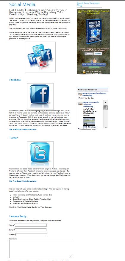
I am going to take you through a full analysis, and plan that you can use as a guide redesigning or designing your landing page. And then in a follow up blog post, at some point in the future, I will show you the new results. So, let’s just dive in and take a look. Here is the current “Social Media” page on GlenKowalski.com. We are going to look at the header, the content, the form and offer itself, and the call to action.

Landing Page Before
Landing Page Heading
Probably the most important piece of a landing page is the headline. If you don't capture your readers attention immediately, chances are very good that you are going to lose them. This heading is not the worst I have ever seen, but it is long and tough to read on this page theme. Spreading out the text vertically would help. And possibly changing the color or emphasizing a couple of words might make it better. I am going to get rid of the starting today, and possibly make that a sub heading. I need to identify a more powerful set of words for the heading that captures the reader’s attention immediately.
Your Landing Page Content
The first thing that I notice when looking at this page, is how long it is. It is stretched out and skinny, so the reader has to scroll through pages of information, just to read what the page is about.
It is also difficult, “wordy” and hard to read. Also, the pictures don't make a lot of sense in the current context, and could be laid out much better.
You want the content on your landing page to be very easy to read. Or even better, easy to scan without fully reading it. Many people don’t want to read everything, so you want to make sure your overall message is clear at first glance.
Bullets, sparse use of bold tags, and good paragraph breaks would go a long way towards making this page much more readable. Also, most of the pictures are not necessary, so I could limit the use of pictures, or at least allow them to flow a little better. Maybe I will even throw in a video.
The most important thing for you to do on your landing page is capture leads. The problem is, most people are not going to know what to do if you don't tell them. Or, even worse, you can cause action paralysis by giving your readers too many options. As a reader of this page, you don't know whether to fill in the lead capture form, “Like” the page, or click on one of the links.
Some small Social Media tag buttons would be ok, so people can share your content, but I am going to get rid of the like box and the commenting box below. Facebook comments might be a little better since at least they have the potential to go viral.
Links and other options should be kept to an absolute minimum so the user only has one choice of action. It might even a good idea to remove all of the navigation options from the menu bar, so there are absolutely no distractions. This becomes an individual decision based on the site itself. I am not sure yet if I will go down that road or not.
Your Landing Page Offer Form
Fortunately, the offer form is above the fold. Being above the fold means that the lead capture is visible on the page without scrolling. This is very important. You want to make the offer easy to access, and immediately visible. So, we will leave the capture form exactly where it is.
However, along those same lines, the offer itself isn't related to what the page is about. If as a reader, you ended up on this landing page, you are interested in social media. Yes blogging is important, and this Power of Blogging ebook is great information. But, it doesn't have anything to do with what the page is about.
You want your offer to give more information about the pages topic.
The form you use to capture leads is also important. You want to capture the minimum amount of information that you can, while still getting enough for your sales or marketing team (or you) to qualify your leads. You want to make it easy, and not scare off your prospect with pages of personal questions.
How much information you ask for depends on your business. Usually a name and an email are sufficient. A phone number would also be valuable. My form utilizes a Facebook capture which is pretty easy since it is one click. I am not a big fan of the “Submit” button, and would prefer it to say download now, or something a little friendlier. Studies have shown that Submit is one of the worst things your button should say.
I should also split test between this and a traditional form since some people may be nervous about connecting with Facebook. We will talk more about testing later.
Your Landing Page Call To Action
Your landing page needs to have a strong call to action. Your page could have no text, no images and nothing but a strong call to action and you will still gather leads. On the other hand, you could have the best offer, the best content and awesome graphics, but if you don't tell your reader what to do, they aren’t going to do anything. This page has some small links telling the reader to click here for a free consultation, but it is hardly compelling.
You need to tell your reader exactly what to do, and only have one option.
Download your free content here. Fill in this form, etc.
Make it powerful, and make it actionable.
Testing Your Landing Page
Remember what I said earlier about split testing? It is impossible to know what will work best for all audiences and all offers and all fields of business. You need to test everything and implement changes. This could be different graphics, wordings, options of the form and more.
Just make sure you test everything, and implement what works.
As you can see, a short analysis of your landing page, or the page you want to convert into a landing page can quickly identify several issues which, when fixed, will help to improve your conversions.
The most important things to analyse are :
- Heading
- Content
- Form
- Call to Action
So go ahead and take a good hard look at your internal landing pages. No one is forcing you to expose your mistakes the way that I just did to you. Just sit down, with a pen and paper and an image (or live version) of your landing page, and dive in. Check out the important points, and you are sure to start improving your lead gathering activities instantly.
And watch for my follow up post where you will see before and after images of this page.
A great landing page(s), making a gripping offer, is one of the most important parts of your inbound marketing strategy. Do your analysis, redesign your landing page and begin gathering more leads today.


